We noticed that the Magazine's title had changed over time and so we made sure to use the latest version. We changed the date to May/June 2011 and added it onto our cover.

We used the same picture of Saidah as she had the perfect expression on her face, but instead of her whole body we just used her head as most of the issues in the 'Little White Lies' magazine. We placed it in the middle of the page, with the Magazine name overlapping it like it does in the other issues.

We created this background by putting some different toned purples and blues on the page, then used the smudge tool to make swirls which created a mysterious dreamlike effect. We then put an artistic effect on it that made it look like a painting and made the edges darker and slightly sharper. We were very happy with the outcome. Even though the background is completely different to our poster and trailer, as it is much darker, we still feel that it suited our film.
We added several artistic effects on the image of Saidah which made it look like a painting. We were experimenting with the effects and so we cannot remember exactly which ones we have on the image now. We made a few versions that we then chose from:
This is the bright version - this would portray it as a comedy better than the other versions as it is more colourful, but it didn't go well with the background - it looks a little out of place.
This is the duller, more purple version - we liked this version the most as it matched the background perfectly and clearly portrayed the dream aspect to our film, whilst also being simpler than the others.
This is the version that was in between the other two - it is still bright, but it goes better with the background and is also artistic - simpler
We were unsure which to pick so we asked a few people which they preferred - they all said they preferred the duller purple one (the one in the middle), we also liked this one as well and so we have decided to use this one.
Below is the completed magazine cover:
We are now starting to create our magazine cover. We have looked at different magazines to find out which one would best suit our film and which one would actually feature our film. We have chosen to create a cover for the 'Little White Lies' magazine.
Here is a presentation that shows the reasons why we chose this magazine:
This is our final Movie poster:

We think we have clearly and effectively portrayed the genre of the film in our poster, whilst also telling the audience a bit about the plot. The bridge symbolises the long, tough journey that our main character has to face in order to cure her problem of falling asleep at random times. We included the pillow to represent her dilemma and we made the background colourful to portray the genre. The glow we placed around the main character helps make her the focus of the poster and the cut out effect we used on the buildings also helps to show the genre.

We created a bridge on Photoshop, using the floor that Saidah was standing on in the picture we took of her, by cutting out the ground on either side of her and then using the 'clone' and 'blend' tools to make the floor look like a path dissapearing in the distance. We darkened the floor, to make it look more realistic, using a 'Satin' effect which also hid any dirt that was on there. We created rectangles to use as the bars on the bridge and placed them along the edge of the path we made.
Once we placed Saidah on the page and positioned her on the bridge we realised that it didn't look very real and so we used a 'burn' effect on the ground behind her to resemble a shadow of her body.

We added in the film title and release date in the same font we had used in the film trailer at the top of the page above the buildings so that it was clear enough to read easily.
We used a 'cut out' artistic effect on the buildings that we added in behind her to make them look colourful rather than the dull colours they actually are. We then created the background (i.e. the sky) by placing some colours on the page and using the 'smudge' tool to merge the colours together which created what looked like a sunset.
We then created the text that goes at the bottom of most film posters:

We searched thorugh the fonts on Photoshop until we came across one that resembled the text they use on real posters (as shown above) then followed the structure, changing what it said to suit our film.
Yesterday afternoon Bareen and I went all the way to central London to find some buildings that we could photograph to include in the background of our poster - we looked for clean, interesting buildings that were of various shapes and sizes so that the background looked more like a city. We had a wide variety of pictures and so we chose a few that we really liked and edited them on Photoshop - we did our best to cut around them without leaving any background or taking a chunk out of the building, so that we were just left with the buildings. We are now trying to place them in a good position on our poster.
This is a prezi that shows the pictures we took:
We have moved on to editing the photo we have chosen to use on our poster:

We have gotten rid of the background and the collum that was at the right of the picture. We intend to cut out Saidah completely i.e. get rid of the floor as well. We are also debating whether or not to change the colour of Saidah's scarf so that it is more colourful and reflects the genre of our film better.
We experimented with the colour of Saidah's scarf by changing it into two other colours to see what it would look like. Here are the edited versions:


Today we met up with our actress, Saidah, who played Kayla, in town to take some photos for our Movie Poster. As I have mentioned previously our idea consists of Kayla standing in front of a group of buildings that indicate a town. We are going to cut Saidah out and put her in front of individually cut out buildings, so we found a building that was plain and in the light to have Saidah stand in front of as we took the photos. It just so happened that the building was green - so we had our very own green screen :). Everything went according to plan and we finished at the time we had planned to. We have picked out the picture we want to use, as shown below:

and are now in the process of edititng it so that we only have Saidah and the floor she is standing on. We like this picture the best because her facial expression is perfect for a comedy - an expression of exaggerated confusion and she is addressing the audience as she is acknowledging the camera which gives the poster a warmer and more personal feel. It almost seems as if she is asking the audience why she keeps falling asleep spontaneously, which is the look we were aiming for as Kayla just wants to know what is going on and how to stop it. Plus, having researched some other comedy movie posters we have realised that most of the characters are looking into the camera. For example:


Below are the other shots we took of Saidah and their pros and cons:

Saidah's pose in this picture was welcoming which we feel may attract the audience, however, she looks a little too happy. We didn't want her to look happy because we felt that it wouldn't reflect the film, as throughout most, if not all, of the film she is worried and confused so you would expect to see that facial expression on the poster, rather than a happy smiling girl.

We also discarded the next picture as we felt she looked a little too sad and we preferred the picture where she looks into the camera. However, we did like the fact that she is looking at the pillow she is holding because it puts focus on, and reflects, her problem in the film.

We felt that the expression on Saidah's face in this picture was a little too nonchalant and amused, which does not reflect her feelings in the film. We also didn't like the way she was too transparently looking at the pillow because, whilst we liked the idea of having the pillow in the shot to convey her problem, we didn't want it shown so obviously.
Now that our trailer is finished we have moved on to creating our own Movie Poster. We already had several ideas in mind so we decided to get them down on paper so that we could pick the one we were most happy with, then expand on it. Like most comedy Movie Posters we wanted to have our main character Kayla in the middle of the page facing the audience:

We are thinking of having a long shot of Kayla (so as to include her whole body) holding a pillow expressing a confused emotion. The pillow would be a clue as to what would be expected in our film and would perhaps be interest some people enough to research the film, which is what a film poster is for - to entice the audience and encourage them to watch the film. Our idea was to have buildings behind her to resemble a sort of city - this would portray her journey to find the 'Bellicus' in London.
Bellow is a rough sketch of our idea:

However, we have thought up some other ideas that we quite liked but we still prefer the idea described above. Although, we may include some aspects of our other ideas in our poster.
Below are the sketches of our other ideas:

We have decided to take out the dream sequence as it looked too out of place and our trailer looked much better without it. We also decided not to use a 'mosaic' effect on our titles that we were thinking of using as some of the quality of our trailer would be reduced because we would have had to put our trailer on a newer edition of iMovie to use the effect. So we found an effect we liked on the version of iMovie that we were using.
This is our final trailer:
This is a rough cut of our trailer:
We are happy with the progress we have made, however there is still a lot that needs to be done and added to our trailer. We have yet to add in the music, which we are thinking of having throughout most of the trailer. We are thinking of creating our own music as we cannot find any non-copyright music that we think goes well with our film on the internet. We also haven't added in the voice over yet, that will be playing over the montage, of the doctor explaining narcolepsy. We are looking at various transitions, on iMovie, that we can use on the film title and release date. So we have yet to add in the titles. We also have a few other things to add in, for example, a shot of Kayla opening her eyes that will go after the dream is finished and a few transitions that we are looking into using. Some of the scenes need to be cut down a little bit more, so we are going to do that as soon as we have added in all of the shots, so that we know exactly how much needs to be cut.
We have been editing the footage we filmed in our 5th filming session. We have tested out a rough version of our trailer by putting the clips in the order we had planned to have them in. When we watched it through we noticed that the 'Dream' scenes, including the 'Scary Lady' scene, a scene where Kayla is in a dark room saying "Where am I?" and a clip of Kayla opening her eyes once the film ended, looked very odd and out of place to the rest of the trailer. I think it may have been the drastic contrast between the realistic scenarios and the surrealism to the dream section and also the contrast in lighting - the lighting was mostly bright in the real scenes and dark in the dream scenes. So these factors may have made it seem too strange. We also thought that people may not understand that it was actually a dream.
We liked the idea of adding in the scene because we wanted to steer away from the disorder narcolepsy and show more of the dream aspect to our film. However, we are contemplating taking it out as it makes the trailer look too odd. We tried to make it fit in more by making a copy of the clip where Kayla opens her eyes after the dream and then we put an effect on it to make it go backwards so that she closed her eyes instead and put this at the beginning of the dream sequence to make it look more like an actual dream. We have also decided to cut out the clip where Kayla says "where am I?" as it looks better without this in the dream scene, she also sounds a little odd when she says it.
We also used some audio effects on the 'scary ladies' voice - we used the 'Cathedral' effect which made the voice echo - and we also changed the whole dream to black and white to make it obvious that it was a dream. We came across a 'warp' transition that looked good on the shot of Kayla closing and opening her eyes as it showed that it was a dream and is meant to be a little strange.
Here is the scene:
We have decided to call our film company 'Useless Productions' to stick to the comedy style, i.e. this production company would be known for creating comedies. Here is our company logo, that we will include in out trailer:
We found this animated background on the internet and placed it on iMovie. We changed the colour from a white background to a blue background to resemble a sky, and then left the part that moves white to look like clouds or snow. We then put our company name in the middle in the font we were planning on using and experimented with the colour until we chose this one.
Last night we decided that to celebrate Halloween in style we would do the slightly scary scene for our trailer. The 'Crazy Lady scene', as we have named it, consists of a dream scenario in which a scary, crazy lady (played by Bareen's sister) gives Kayla (Saidah) instructions on how to resolve her problem of falling asleep at random times.
We used a LOT of make-up to make Bareen's sister look the part including blue eyeshadow and bright lipstick that was put on in the heart shape style that we borrowed from the 'Queen of Hearts' in the 'Alice in Wonderland' (2010) as shown below:
 We also used long fake eyelashes, a lot of mascara and a lot of blusher. We had planned for her hair to look similar to that of 'Bellatrix Lestrange' in 'Harry Potter and the Order of the Phoenix':

Bareen's sister came up with a brilliant plan that worked perfectly to make her hair look like this. We put b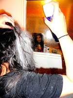 aby powder in her hair to make it look grey at the top and streaks at random places. We then pinned up the top layer of her hair to make it look big and then messed it up a little bit to portray her as crazy.
This is the outcome:


We were going to film the 'Train scene' today as well, which we had changed into a tram rather than a train as it would be easier to film, but we couldn't because Bareen had to work later than she thought and so it was too dark to film when she got back. We are discussing whether or not to leave out this scene entirely as we seem to have enough footage for our trailer already because some of the shots last longer than we had planned.
We also re-filmed the 'Restaurant scene' in this session as last time the cameras battery ran out and the only take we had filmed did not turn out very well. We improved the set a lot from last time so that we could convey a romantic atmosphere more effectively:
Last time:


This time:
We filmed it in Bareen's living room again, but changed the position of the table so that the TV cannot be seen as it had been the last time we filmed. We placed the table in the same spot that we filmed the 'Doctor's scene' in, but we moved the big dining table and instead used some small tables for the characters to sit at. We covered the table with a nice duvet cover, which acted as a table cloth, and put the usual props that you would find in a restaurant on the table - a wine bottle, wine glasses, plates, napkins, salt and pepper shakers. We also put some props - flowers and several candles - on another table in the corner and turned the light down to create a more romantic atmosphere.
I think the filming session went very well and we were able to get the 'Restaurant scene' done relatively quickly as we had already tried to film this scene once so we knew exactly what we were doing this time. We got all of the shots that we intended to film for the 'Restaurant scene' and the 'Crazy Lady scene' and intend to edit them as soon as we can.
We went into school today to upload what we have filmed in the last two sessions and then start editing it. Our footage was not letterboxing like it normally does as we had not filmed with the same camera and the camera we had used films in a different format. This was bad news as it meant that half of our trailer would be letterboxed and the other half not. After worrying about this for a while we started to think about whether or not we could re-shoot one half of our footage,as we didn't like the fact that it would be different, but we decided against it as there would be too much to do. However, as we were flicking through the effects on IMovie looking for anything we might want to use in our trailer, we found an effect that covers the top and bottom of the footage in a black box that resembled the letterboxing perfectly. We happily started to use this on the non-letterboxed footage so that it would match the rest of the trailer. Of course we made sure that it was exactly the same size as the actual letterbox.
Filming Schedule:

Filming Session: 
For this filming session we went to Bareen's aunt and uncle's house to film the birthday scene - where Kayla goes to her friend's (Bareen) cousin's birthday and falls asleep on the cake. There were amazingly no problems this time - we brought a few cakes, in case the shots went wrong, however we only used one. We also bought balloons and spread them out on the table to show it was a party, as shown in the picture to the left.

The picture to the right again shows the set. We also bought some party blowers - which i am holding in this picture - so that Bareen could use one after her cousin blew out the candle.
We were hoping to get the shot perfect the first time as we thought it would take a while to clean up, but we had to take a second shot as Saidah only fell on the edge of the cake because she didn't want her whole face covered in sugar. We decided that it didn't look good that way so we turned the cake over so that there was no sugar and had Bareen's cousin knock the candle off with a knife - we decided to have him do it because it would be more believable that he only did it so that he could eat it straight away, rather than having his mum take the candle away. This time the shot went perfectly, with Saidah falling on the middle of the cake.
The pictures below show us blowing up balloons:


We are now searching on 'www.urbanfonts.com' to find the perfect font for our title 'Sweet Dreams'. We picked out 3 different fonts that we liked and thought suited our film well by clearly showing the genre. Here were the ones we were considering:

We liked this font as we thought that it was cheerful and clearly showed the genre of our film. However, we thought that by using it we would only be targeting young females as the curly letters make it seem a bit 'childish' and 'girly'.

We liked this font as the 'bubble writing' style and the odd angles the letters are at represent the comedy genre well. This font would also appeal to both the female and male population. However, we preferred the font below for our actual title and so we decided to use this font for our company name instead.

We thought that this font would be perfect for our title as it has rounder edges than the one above, which makes it more appropriate for a comedy, and also has the 'bubble writing' style which also shows the genre. It is also quite bold and so will attract the audiences attention.
Filming Schedule:

Filming Session:
For this filming session we had to re-do a couple of shots from our first filming session, where Dr Gray tells Kayla that she doesn't actually have Narcolepsy, due to the fact that my voice was too quiet, so this time we brought a microphone with us. There was a slight problem as Saidah brought a different coloured headband to the one she brought last time we filmed this scene. However, once we thought about it more, we realised that you can't actually see the headband in most of the shots, from the first filming session, that we were intending to use as we had used mainly close-ups of our bodies to keep the focus on the tests Dr. Gray was carrying out. We did, however, have to re-do one other shot that we hadn't planned to re-do - Kayla's reaction to the news - as that was the only time we see the headband she was wearing. We think these shots went well and they didn't take us long at all because we knew exactly what we had to do.
We then moved on to another scene where Kayla falls asleep whilst getting ready for a party. We decided to use Bareen's bedroom as she had a mirror the perfect size and in the perfect position to film. Filming this shot went quickly, with no problems, and we are happy with the footage we got.

The picture on the left shows the two types of lipstick we had to choose from. We decided to go for the pink one because it was brighter and so would be easier to see.

The picture on the right is of Saidah wiping off the lipstick after haven taken the first take of the shot.

The picture on the left shows me filming Saidah sleeping on the floor. We decided to get a shot of this, even though we hadn't planned to, just incase it would look better with a close-up of Kayla sleeping.

The picture on the right, again shows me filming Saidah. This is the second take of the shot, we decided that the first shot had looked slightly dark so we decided to use Bareen's lamp to produce some light - you can see her holding it up.

We had one last shot to film, where Kayla falls asleep whilst typing an essay, so we used the desk in Bareen's bedroom for this shot - the picture on the left shows Bareen moving things so that we can place the camera there to film. We directed Saidah to fall forwards onto her hand which would be holding down the 'Z' button. Even though this seemed slightly cheesy, we decided to put it in to make the scene a little bit funnier.
 Below is our actual final poster that we have made the changes to:
 Below is our actual final poster that we have made the changes to:


